 Managing information often results in cumbersome data sets that are not friendly to readers or the poor saps curating them. Whether working through thousands of pages of coded results from polling data or attempting to glean relevant information from lengthy, turgid reports, sometimes we let ourselves get bogged down in mass rather than focusing on that which is salient.
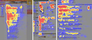
Enter your new best friend: graphics. Recent research found that the human brain processes images at a rate 60,000 times faster than text. The eye is drawn to visuals. Our brains crave information that is easier to access. This isn’t because we are dumb. It’s because reading comprehension is, quite simply, a more complicated task for our minds. A graphic—whether in the form of a map, chart, or infographic—is a powerful tool to convey complex data in a more memorable, marketable, and satisfying way.
This all sounds well and good, but where to start? Many of us appreciate visual learning but feel like we lack the creativity or know-how to produce visuals on our own. If your organization has graphic design professionals, get to know them! If it doesn’t, there are still a number of available tools that can help you create graphics that will explain your data in a way far more appealing than simple text. You don’t need to be an Adobe InDesign expert to make something compelling. A few online apps are listed below:
- Canva is among the most popular infographic services online, offering drag-and-drop functionality and a number of available templates. The free version allows for teams of up to 10, 1 GB of storage, and access to over 8,000 templates, though the free templates are not nearly as useful as the paid ones. Paid accounts start at $12.95 per month and include custom branding, templates, and more.
- Snappa has an enormous library of photos and graphics, but the free tier limits the number of downloads and templates available. For $10 per month a user can upload custom fonts and have unlimited downloads.
- Visme is one of Canva’s chief competitors. Its free version has some limitations, but it allows for PNG and JPG downloads. Paid versions remove Visme branding and open access to premium templates and PDF downloads. Visme also allows for interactive online charts.
- Infogram, which was recently purchased by presentation company Prezi, isn’t just for infographics. It can import Excel data and link live Google Sheets to create much more appealing charts than what Microsoft gives you. It is also capable of building maps. And a big upside? All of these can be embedded to be interactive on your website.
- PicMonkey has no free tier, but its top level costs $8.33 per month and allows for unlimited storage. Overall, its editing suit is not as robust as Canva or Snappa and is better for photo editing than graphic design.
- Visually connects teams with freelance designers, bringing the on-demand economy to graphic design. Teams can request a wide range of media, including infographics, videos, ebooks, and presentations.
- Venngage might be the most capable of the bunch when it comes to infographics, but that comes at a cost. Its free tier tops out at 5 infographics and is available to students. If you want full access to everything, including your company’s branding, the $49 fee is substantially more than the competition.
Hold on. Do you see what happened right there? That’s a bunch of text that is perfectly capable of being put in a graphic!
Chances are—and research shows—that the reader was more likely to look at this simple chart first rather than engage with the descriptive list above it. The list contains great information, including more specifics on pricing, but in this case, a comparison chart quickly conveys information in a way that is easy to remember. (And in the spirit of full disclosure, I made it in a few minutes with Infogram.)
Of course, not all data is worth visualizing. When you ponder how to create a graphic for your data, ask yourself if the graphic tells a story. If it doesn’t, then it might be worth reconsidering whether to create an image this time around.
Smart use of graphics will do wonders for the presentation of your data. Graphics will break up pages of text in a lengthy report. They will keep listeners’ attention during a presentation. They stimulate activity on social media. They improve your brand and boost website traffic. Do not fear that which you don’t know. Embrace the power of the graphic.